General Description and Background
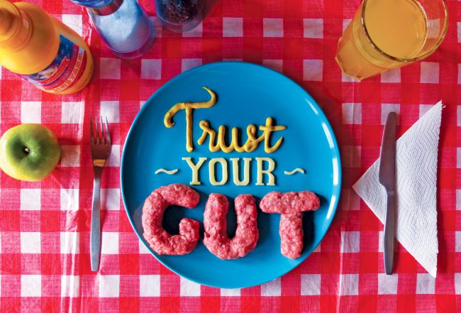
The graphic design above is known as the “Trust your Gut?” design and was created by Stefan Sagmeister. Stefan Sagmeister is a New York-based graphic designer, storyteller, and typographer. He is a co-founder of the Sagmeister & Wash Inc. design firm (Miane, 2015). He has designed album covers for musicians such as Jay Z, Lou Reed, The Rolling Stones, David Byrne, and Aerosmith. For instance, he designed a monograph known as “Made You Look.” Also, Stefan Sagmeister is a Grammy award-winning graphic design artist and one of the most influential designers in the world. His artwork has been inspired by animation and design all over the globe. His book “Things I have Learned in My Life So Far” has been a hit since it was released in 2008. His book gives advice, tricks, and career tips to inspiring graphic designers. His typographies are based on the word “Gut.” Most of his work is for the music industry, but in recent years, he has specialized in three other artistic works (Maine, 2015). He has dedicated his work to books and publications, scientific community social issues, and the music industry.
“Trust your Gut?” design is the food of thought design that inspires people to have self-confidence and value self-esteem. Therefore, the design’s typography contains inspiring words. Stephan Sagmeister designed these graphics to inspire upcoming illustrators, animators, and graphic designers. He created the design in 2008.
Graphic Design Appearance
The piece of graphic design looks like a photograph of different items put on the table. The graphic designs contain the surface of the table, which is covered by a carpet containing red and white colors. On the table, there is a half-full glass of juice, an apple, a container containing salt, a plate with a designed cake, and a fork. Thus, the graphic design appears like a well-taken photo of a person who is already in I process of eating the cake. The graphic design typography “Trust your Gut” is at the center of the design.
Visual Experience
Looking into the design, viewers can create imaginations of the items in the design. Thus, one can be able to visualize what is happening in his mind by just looking at the design. Therefore, in the design, one can visualize that someone is in the process of consuming and drinking the foodstuff in the design since the tools for eating and food are well depicted in the design. Similarly, you can be able to imagine the same for the other items in the graphic. Therefore, by looking at the images, one can connect to a memory in which he or she has interacted with the items. The way the items are arranged and designed helps the viewer to see the items as real (Ball 45). Also, the viewers can see multiple things and relate to them. For instance, in an image of a glass of juice, one can see a glass containing juice. The color differences in the graphic design help in creating real items. For instance, the color orange helps in creating juice, and the color green helps in creating an apple fruit image. Consequently, different colors in the far right image help the viewers to understand what is designer wants you to see. The surface of the images is blank, and the plate contains the words “Trust your Gut.” Therefore, graphic design creates a visual experience for viewers by making them connect the images to the items in the real world. Thus, one can be able to tell what is happening at the moment in the design (Ball 14).
Formal Relationship between the Visual Elements of Graphic Design
Line
The lines in the graphic designs form the foundation of the images. The line in the design is used to demonstrate different visual elements. First, the line is used to illustrate the shapes of the images. Also, lines help in suggesting the form, structure, and pattern of the images. Also, the line in the images shows in-depth color. For instance, in graphic design, there are different images from one another (Downs 87). This helps to show the calmness of the design. The different lines in the images help in capturing the viewers’ attention while viewing the images.
Shape
The Graphic designs consist of different shapes. First, the surface is rectangular, and it appears to change depending on the viewpoint. The designer used the perspective technique while designing the image. Thus, the image has a circle-type of shape, which controls the viewers feeling by representing a continuous process. This is true because if even we literary interpret the image, one can say that the image was photographed when someone was in the process of eating. Thus, the shape is more triangular, which leads the eye in an upward movement.
Tone
The tone is the lightness or darkness of a color in an artwork. The tonal values are influenced to alter the image’s perspective. In the graphic design, the color tone is used to create a contrast between light and dark. This helps the viewers to identify the images and relate them to real objects. Also, the designer used to create an illusion of form.
Color
The designer of the graphic uses different colors in each image to bring out the shapes, lines, points, and balance in the design. Thus, color is the strongest visual element in the graphic designer above. The colors in the graphic design help in bringing out the mood of the design. The color is used in different ways in the design. Thus, it is used as light, tone, pattern, form, contrast, and symbol. For instance, the color helps in showing the clarity of elements of tone, shape, and line.
Texture
The texture is the smoothness or roughness of the materials of images. The texture of the images in the graphic design is both smooth and rough. The roughness helps the viewer to understand the image. Texture can be identified by sight or touch.
Typographic Analysis
Every design needs a typographic hierarchy, which helps in catching readers’ and viewers’ attention to the design. Thus, the typographic analysis is about the organization and formatting of the graphic design in such a way that readers can easily see what’s the most important, which allows them to internalize the layout at a glance and quickly scan to search for the information associated with the graphic design (Down, 67). The importance of the typographic hierarchy is that it enhances the readability and usability of the design. Thus, effective typography has three levels of typography. Level-one: the content and information in the design should be the most visible element in design. Level two: this helps in organizing your design work into sections, but it the less visible compared to level one and helps in directing viewers. Level three: this typography is key to design, and it contains the message of the design. For example, level-three typography, in our case, is “Trust your Gut?” Thus, this piece of graphic design is primarily typographic.
Elements Composition
Font sizes are an important aspect of creating a contrast between different typographic elements in the design. Although the graphic design doesn’t start with the text, the message is bolded to capture viewers’ attention the moment they look at the design.
The use of contrasting typefaces is a key aspect of design. The “Trust your Got?” message in the design is a sans-serif typeface in contrast with other information at the bottom of the design being serif type. Thus, contrast is an important component of creating successful typography. The graphic design has a combination of a sans-serif with a serif typeface which makes the design an outstanding piece. This helps the viewers to identify the main information at a glance.
The font has different styles and weights in the graphic design. Different styles of the design include the bolded “Trust your Gut?” information in the images and the message at the bottom of the design. The different style is the lightness or darkness of the typeface. The dim light and bold are weights in graphic design. The bold in-text makes the design more visible; thus, the sans-serif type in the design is in the same font, but lightness and heaviness are different.
The tone of the color makes the design stand out. Different colors convey different meanings and emotions. Therefore, the colors in the design match up with the purpose and mood of the design.
Communication Analysis
The signs are different signs in the graphic design. First, there are signs of the food substance where they are depicted as being eaten, while the second sign is the typeface “Trust your Gut?” phrase. The “Trust your Gut?” functions of the graphic design are used to dictate the form. The “Trust your Gut?” is grammatically incorrect; this makes the design modernist since it uses negative space to structure the sans-typeface.
Reflection
After doing this activity, I come to understand typography reflects what society feels towards something. The typography helps to create an easy way to understand the message visually. Thus, at a glance, I would look and understand what the design is about. There are different ads and designs we see every day, but this activity has helped in gain experience with the ads I see. I have to realize that the activity has presented me with the perfect opportunity for a better understanding of graphic design. The task has made me think differently about the UI of an app. Also, I have noticed that different elements in graphic design reflect and represent certain emotions. For example, the circle shape represents continuation. The typeface in graphic design should always allow the viewers to understand the design by just viewing it. The hierarchy of the typography helps the viewers to easily navigate the graphical design. Also, the task has helped in understand the elements of graphic design. For instance, lines in design help in capturing the viewers’ attention while viewing the images while the colors in the graphic design help in bringing out the mood of the design. Thus, different elements help in creating different visual perspectives in graphic design.
Works Cited
Maine, Sammy. (2015). “Sagmeister-inspired typography project is food for thought” Retrieved from https://www.creativebloq.com/typography/sagmeister-inspired-typography-project-food-thought-51514908
Ball, Michael S., and Gregory WH Smith. Analyzing visual data. Vol. 24. Sage, 1992.
Downs, Simon. The graphic communication handbook. Routledge, 2013.
Keller, Kevin Lane. “Understanding brands, branding and brand equity.” Interactive Marketing 5.1 (2003): 7-20.
Mahajan, Vijay, and Yoram Wind. “Got emotional product positioning?.” Marketing Management 11.3 (2002): 36
| Poggenpohl, Sharon Helmer. “Design Journals: Context, Serendipity, and Value.” Visible Language 50.1 (2016): 25. |
White, Alex W. The elements of graphic design: space, unity, page architecture, and type. Skyhorse Publishing, Inc., 2011.
Cite This Work
To export a reference to this article please select a referencing stye below:
Academic Master Education Team is a group of academic editors and subject specialists responsible for producing structured, research-backed essays across multiple disciplines. Each article is developed following Academic Master’s Editorial Policy and supported by credible academic references. The team ensures clarity, citation accuracy, and adherence to ethical academic writing standards
Content reviewed under Academic Master Editorial Policy.
- This author does not have any more posts.


