
Introduction
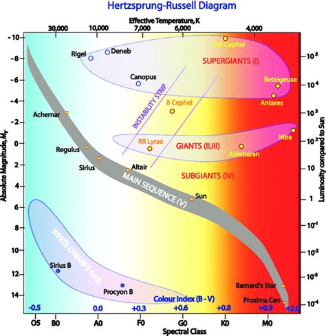
The Hertzsprung–Russell diagram, or H–R diagram, organizes stars according to luminosity and surface temperature and reveals why the stars nearest to the Sun look very different from the stars that appear brightest in Earth’s night sky. Luminosity increases upward on the diagram, while temperature generally decreases from left to right. Most stars occupy the main sequence, extending from hot, luminous blue stars in the upper left to cool, dim red stars in the lower right. Giants and supergiants lie above the main sequence because their enormous radii allow high luminosity, while white dwarfs lie below it because they are extremely small despite having high surface temperatures. A nearest-star sample is selected primarily by distance, whereas a brightest-star sample is selected by apparent brightness. Those criteria create different observational biases. The comparison therefore teaches two lessons simultaneously: how stellar temperature, radius, and luminosity are related physically, and why the objects most visible in the night sky are not necessarily representative of the stars that are most common in the Milky Way.
Why the Two Samples Overlap Only Partly
A star appears in a nearby sample because its distance from the Sun is small, while a star appears in a brightest-star sample because enough of its light reaches Earth to make it conspicuous. Apparent brightness depends on both intrinsic luminosity and distance. A very luminous star can remain bright from hundreds of light-years away, whereas a low-luminosity red dwarf may become detectable only within the immediate solar neighborhood. Sirius A illustrates how one star can satisfy both selection rules: it is only about 8.6 light-years away and is also intrinsically more luminous than the Sun, making it the brightest star in the nighttime sky. The limited overlap is therefore expected and should not be interpreted as evidence that the shared stars belong to a special evolutionary category. Distance and apparent brightness are observational properties, not stages of stellar development. If a classroom assignment asks for an exact overlap percentage, the correct value must be calculated from the names in the assigned tables rather than inferred from a generic H–R diagram or another catalog.
Selection Effects Shape What the Sky Seems to Contain
The difference between the samples is a classic example of observational selection. A distance-limited sample includes objects within a defined volume and therefore gives a more representative picture of the local stellar population, provided the catalog is complete enough to detect faint members. A brightness-limited sample favors objects that can be seen across large distances, which means intrinsically luminous stars are strongly overrepresented. This is related to Malmquist bias: luminous objects remain detectable over much larger volumes of space than faint ones. If one class of star can be detected ten times farther away than another, the searchable volume is roughly one thousand times larger because volume scales with the cube of distance. The visual night sky therefore gives an intuitively misleading census. Rare luminous giants, supergiants, and massive main-sequence stars can dominate what people notice, while the far more numerous red dwarfs contribute relatively little visible light and disappear quickly with distance. The H–R comparison transforms that bias into something students can see directly.
Nearest Stars: The Importance of Red Dwarfs
The nearest-star sample is normally dominated by cool, low-mass main-sequence stars, especially M-type red dwarfs. These stars occupy the lower-right region of the H–R diagram because they have relatively low surface temperatures, small radii, and low luminosities. Barnard’s Star is a useful example: modern measurements place its effective temperature near 3,100 K, its radius at roughly one-fifth of the Sun’s radius, and its luminosity at only a small fraction of the Sun’s output. Proxima Centauri is similarly faint. Such stars are difficult to see from great distances, yet they are abundant and remain on the main sequence for extremely long periods because they consume hydrogen slowly. Their prevalence explains why a nearby census looks redder and dimmer than the familiar naked-eye sky. The word “nearest” should not be treated as synonymous with “coolest,” however. A local sample can also contain hotter stars and white dwarfs. Proximity is determined only by distance, so stellar type and evolutionary state still vary within the nearby population.
Brightest Stars: Luminosity Can Come From Heat or Size
The brightest-star sample contains a disproportionate number of intrinsically luminous objects, but high luminosity does not arise from one physical pathway. Hot, massive main-sequence stars can radiate enormous energy because of their high surface temperatures, while cooler giants and supergiants can also be extremely luminous because their radiating surfaces are vast. Canopus demonstrates the second route. It is an evolved yellow-white star with a temperature of roughly 7,500 K and a radius more than seventy times that of the Sun, so its total luminosity is enormous even though much hotter blue stars exist. This is why a claim that red giants are always the brightest stars would be inaccurate. Luminosity depends on both temperature and radius. The brightest-star list may include hot blue stars, white or yellow luminous stars, and cool red supergiants. What unites them is not one color or evolutionary stage but the ability to emit enough light that they remain prominent despite often being far more distant than the stars in the local sample.
Temperature, Radius, and the Stefan–Boltzmann Relationship
The H–R diagram becomes physically meaningful when luminosity is connected with stellar radius and surface temperature. The Stefan–Boltzmann relation, L = 4πR²σT⁴, shows that luminosity increases with radiating area and rises very strongly with temperature. This explains two apparently paradoxical regions of the diagram. White dwarfs can have extremely high surface temperatures but remain faint because their radii are comparable to Earth’s rather than the Sun’s. Sirius B, for example, is a hot white dwarf near Sirius A yet is thousands of times fainter than its companion because its emitting surface is so small. Red giants show the opposite combination. Their surfaces may be cooler than the Sun’s, but their radii can be tens or hundreds of times larger, producing high total luminosity. Students should therefore avoid reading temperature as a direct substitute for brightness. A star’s location on the H–R diagram represents the interaction of temperature, size, and evolutionary state, and these variables must be interpreted together rather than as isolated rankings.
Evolutionary State Should Not Be Inferred From Sample Membership
Stars in the nearest and brightest lists do not follow one common evolutionary destiny. Stellar evolution depends principally on initial mass, composition, and subsequent mass loss or interaction. Low- and intermediate-mass stars spend long periods on the main sequence, later expand into red giants, shed outer layers, and generally leave white-dwarf remnants. More massive stars evolve more rapidly, may become supergiants, and can end in core-collapse supernovae that leave neutron stars or black holes depending on the remaining core mass. Membership in a nearby sample or a bright sample says nothing by itself about which pathway a star will follow. It is also incorrect to treat white dwarfs as a major category among the visually brightest stars merely because some are hot. Their small radii generally make them intrinsically faint. Evolutionary interpretation should come from the star’s position, mass, composition, and related observations. The two classroom samples are useful because they demonstrate selection effects, not because they divide stars into separate evolutionary sequences.
How to Interpret the Laboratory Data Responsibly
When a laboratory table provides luminosity, temperature, radius, spectral type, or distance, exact maxima and minima should be obtained by sorting the supplied data rather than importing values from outside examples. The star with the highest luminosity in one classroom dataset may differ from the highest entry in another because sample definitions and catalogs vary. The same caution applies to the hottest, coolest, largest, and smallest objects. An H–R plot should then be used to identify broader patterns: nearby stars clustering along the lower main sequence, conspicuous bright stars extending into the upper main sequence and giant regions, and white dwarfs occupying a hot but low-luminosity zone. If two symbols or colors distinguish the groups, overlap becomes visually apparent. The strongest conclusion is comparative rather than based on one memorized star name. A scientifically careful report separates measurements derived from the assigned dataset from external examples used to explain the physics. This prevents a generic astronomy fact from being presented incorrectly as a result of a specific laboratory exercise.
Conclusion
Comparing the nearest and brightest stars on an H–R diagram shows why the visible night sky is an incomplete guide to the true stellar population. Nearby samples contain many cool, faint, low-mass red dwarfs because these stars are extremely common, whereas brightness-limited samples emphasize rare but intrinsically luminous main-sequence stars, giants, and supergiants that can be seen across much greater distances. The contrast is created by selection criteria, not by two separate evolutionary pathways. The diagram also clarifies that luminosity depends on both surface temperature and radius: white dwarfs can be hot but faint because they are tiny, while giants can be comparatively cool yet brilliant because of their enormous surface area. Exact laboratory answers should still come from the supplied tables, especially when identifying overlap, maximum luminosity, temperature, or radius. The broader astrophysical result is robust. Very dim stars are substantially more numerous than the stars that dominate the naked-eye sky, and the H–R diagram reveals the physical and observational reasons for that difference.
References
Babusiaux, C., et al. (2018). Gaia Data Release 2: Observational Hertzsprung–Russell diagrams. Astronomy & Astrophysics, 616, A10.
Dawson, P. C., & De Robertis, M. M. (2004). Barnard’s Star and the M dwarf temperature scale. The Astronomical Journal, 127(5), 2909–2914.
NASA Science. (2025). The Dog Star, Sirius, and its tiny companion.
Winters, J. G., et al. (2019). The stellar multiplicity rate of M dwarfs within 25 pc. The Astronomical Journal, 157(6).
Cite This Work
To export a reference to this article please select a referencing stye below:

Academic Master Education Team is a group of academic editors and subject specialists responsible for producing structured, research-backed essays across multiple disciplines. Each article is developed following Academic Master’s Editorial Policy and supported by credible academic references. The team ensures clarity, citation accuracy, and adherence to ethical academic writing standards
Content reviewed under Academic Master Editorial Policy.